Colour and Design Trends for 2019
Share

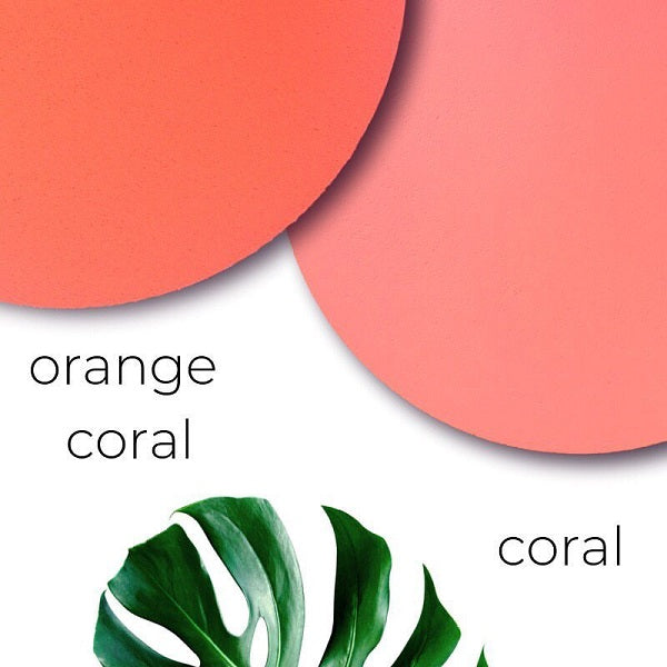
Pantone Colour of the Year – Living Coral
Living Coral is 2019’s Pantone colour of the year. Don’t think you’ve seen much of it? Look again honey, its popping up everywhere!
Living Coral is warm, positive and reminds us of tropical holidays. In a word – playful. Living coral doesn’t want you to take yourself too seriously which is why you’ll see her in every type of homeware item as well as sneakers, earrings and wide leg trousers.
Handmade pieces
Items using natural elements such as macramé plant hangers and wooden containers are especially popular. Fast-fashion homeware moves on to make way for beautiful and useful handmade pieces.
Curves
In mirrors, doorways, tables and chairs. Softer edges pull you into a room because it gives the impression of warmth and relaxation.

Sage Green
We’ve seen a lot of green over the past few years as an eco-friendly sustainable future has not only becomes fashionable, but absolutely necessary. Look out for soft greens on walls in particular.
Personally speaking, there’s a lot of plant life happening on our entrance way and it never disappoints! They’re known for purifying the air of course, but that’s not something I can see – what I do know to be true is that plants always put a smile on my face.

Softer Hues
Homewares and clothing are showing softer colour alternatives. Black is replaced by navy blue or grey, fire engine red is replaced by raspberry red, and chocolate brown is replaced by taupe.
Mustard and sunshine yellow look fantastic when used as accessories or accents like Mustard’s skinny locker. We also like the fact that they are sisters producing cool stuff and making waves.
A final word
Whatever trends dictate, if you’re playing with colour in your home make sure you love it. You are the one living with it after all. Other than that, be brave and remember – paint is your best (and most economical) interior friend. Try it, love it or hate it, paint over it.

Images from: homestolove, sfgirlbybay and oino.site
